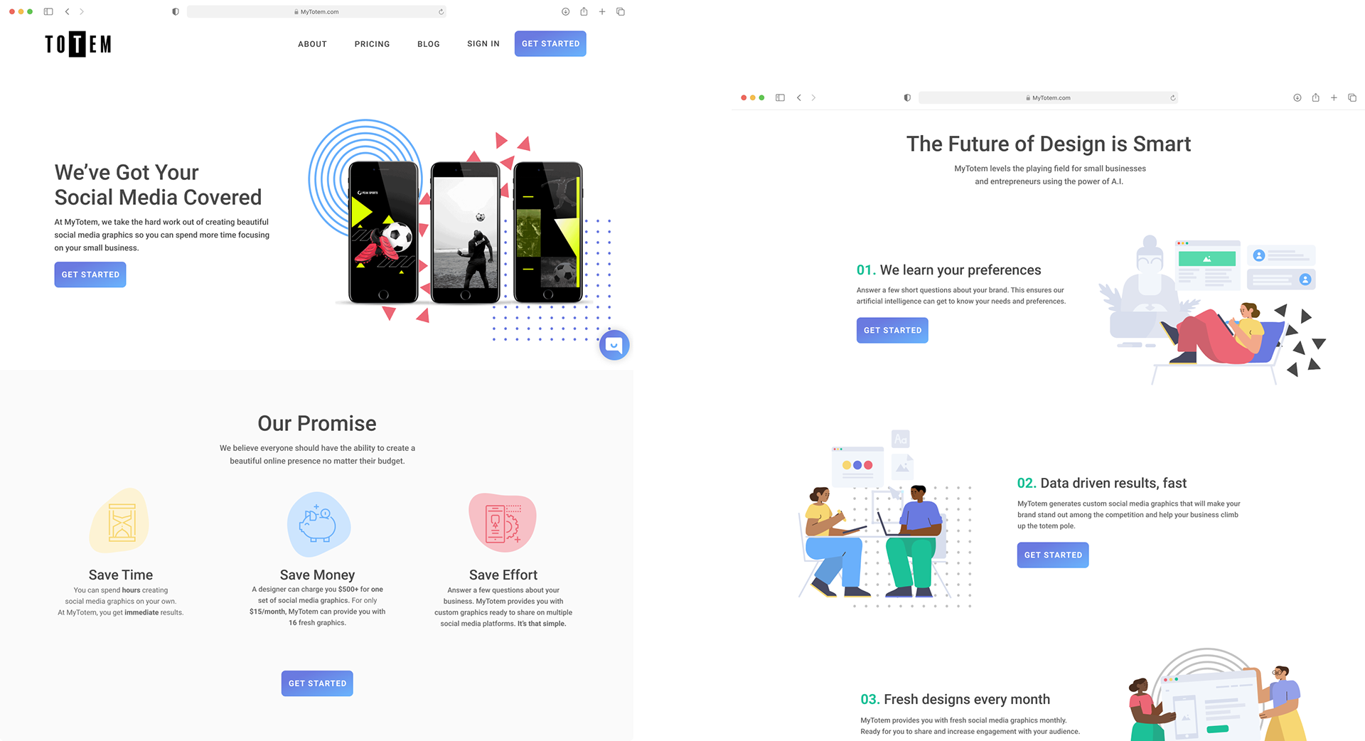
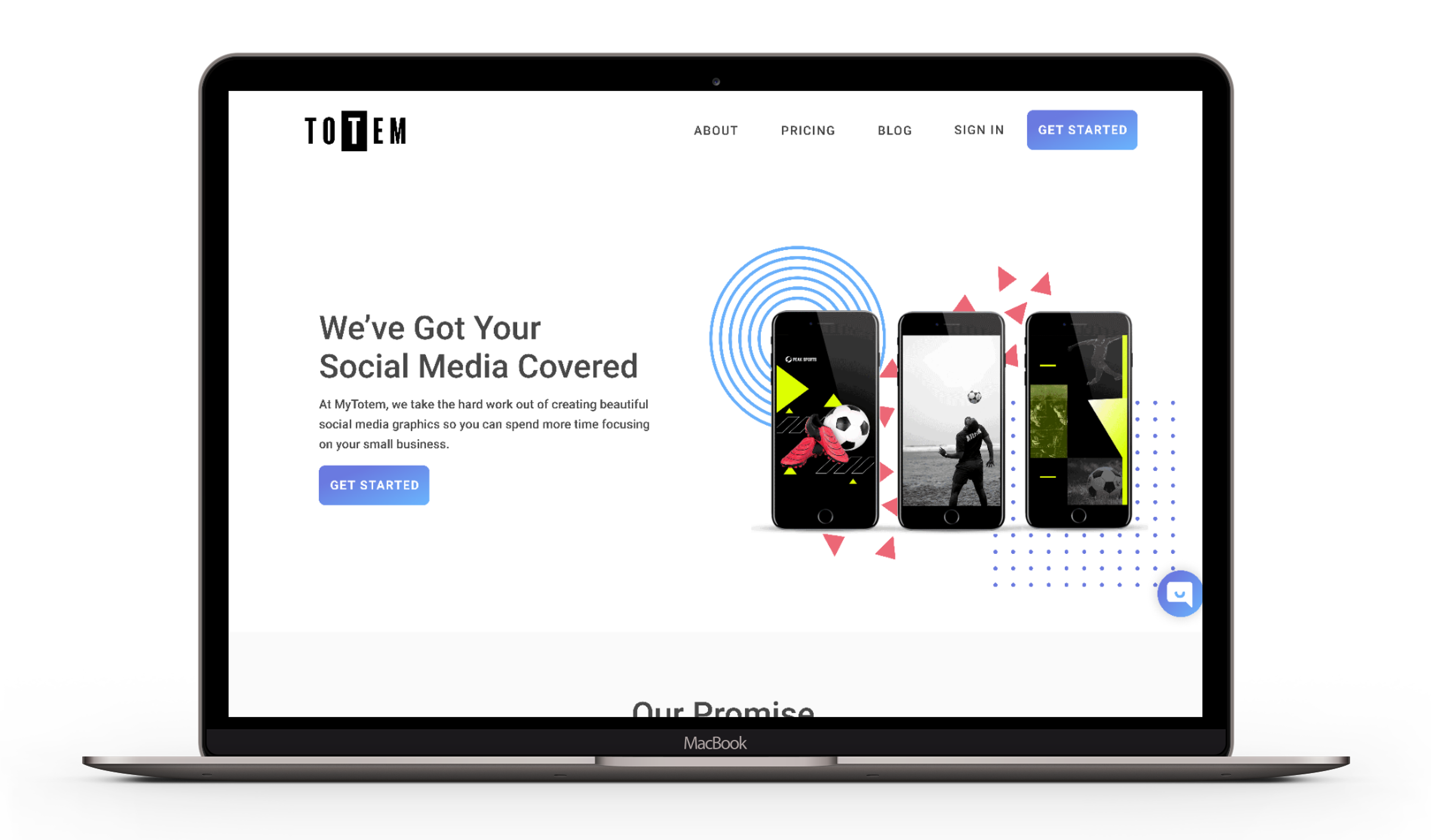
MyTotem is an instant AI-powered brand maker that creates custom design essentials for small businesses.
Duration
3 week sprint
My Role
Producer & UX/UI Designer
Teammates
Alexis Wright-UI Lead
Christian Pirnie-UX Research Lead
Methods
User Interviews
Usability Tests
Heuristics Evaluation
Competitive & Comparative Analysis
Persona Development
Journey Mapping
Affinity Mapping
Wire-framing
Prototyping
Tools
Figma
Sketching
The Challenge
Our client’s potential customers were getting stuck during onboarding then dropping from their site. They wanted to make the process more seamless and with less friction for their target user: small business owners.
The Project Goal
The goal was to figure out why users were leaving the website's homepage so quickly so we could find a way to better engage users on the homepage, encourage them to click call to action (CTA) button and provide a seamless and enjoyable onboarding experience.
Discovery & Research
To better understand our client's problem, we performed a heuristics evaluation, competitive & comparative analysis and conducted user interviews
From performing the heuristics there were three things that stood out the most
1. Seems like a social media branding company
2. Pricing on the main page is vague
3. Taking the quiz is the only path whether the user has an existing brand or not
We wanted to know what users had to say.
We held 5 user interviews with current clients, potential clients, and some business owners. Most of them located in the Atlanta, GA area.
We learned users wanted a quiz that was not too long but also in depth enough to really understand their brand.
They also wanted to know what they would be paying for-step by step.
We were inspired by the look and feel of competitors and indirect competitors onboarding process such as Zebrand, Looka, Stichfix, Tailorbrand.
Meet Shani & Edwina
Side Hustle Shani
Problem Statement
"I need an inexpensive social media tool to help build my unique brand because time and money are two things I don't have"
How Might We...
Show Shani that MyTotem is the best match for her business
Entrepreneur Edwina
Problem Statement
"I need a quiz that makes me feel confident that I will receive quality social media graphics. I don't have the time or knowledge to make them myself."
How Might We..
Make the quiz more engaging?


Ideation Time
We brainstormed ideas around how to improve the home page so it conveys the service's benefits and how to make the onboarding quiz more engaging
Key Ideas
Using a totem pole as the progress bar since the client mentioned helping small businesses climb the totem pole and that’s where the name came from
A quiz that makes sure the client and small business are a good match
None of us sketched a step by step guide which was interesting
We all drew out some kind of price comparison and package detail
Two of us drew out testimonials
We wanted to make sure we were setting the right tone for the call to action button. So we sent out a survey...
98% of survey participants said that they would select the “Get started” CTA over “Take the quiz”
Designing
Once we put those pieces together. It was time to build out our wireframes. What we thought was going to be a small project actually turned out to be long days, late nights and even a full holiday weekend of wire framing, prototyping and testing.
Testing
Users were confused by language on the homepage
"What's included in the free trial? It's very vague. Will I get 1 or 16?"
"It took me a long time to figure out what you do and most people wouldn’t spend that much time scrolling"
Our client had one ask when it came to the quiz-to keep the "What is your favorite shape question."
The funny thing is the users had the toughest time with that question. They didn't understand why it was being asked.
"What does shapes mean I'm getting?"
Users indicated that more information should be given about the questionnaire before it begins
"I'm hesitant, because I thought this screen would be like "hey, we're gonna do the thing""
Looking back I wish my team and I had created and tested a paper prototype before moving to the lo-fi. I think it would have saved us some time by addressing some of the clarification issues even earlier in the testing process.
Final Thoughts
The client was thrilled with the design. The next step is for them to have their developer team build the design out with the rest of the site updates they have in mind.
Having a background and passion for marketing, one of my favorite parts was being able analyze the client's google analytics data for their site and use the insights to support design decisions that were made. This has been my favorite project thus far. Truly enjoyed every minute working with my teammates and the client on this on