
Three Angels Painting is a home improvement business started out of Franklin, North Carolina with a goal of providing excellent flooring, interior remodeling, and painting services.
Duration
1 week sprint
My Role
Producer & UX/UI Designer
Teammates
Joshua Rizek- Software Engineer
Christian Matos- Software Engineer
Methods
Heuristics Evaluation
Competitive & Comparative Analysis
Persona Development
Journey Mapping
Affinity Mapping
Wire-framing
Prototyping
Tools
Figma
Sketching
The Challenge
A software developer connected with me and suggested a collaboration to help with creating a website from scratch for a client he was working with, Three Angels Painting. The client currently did not have an online presence.
The Goal
The goal create the client's first website that would help them start to build an online presence so that they would be easier to find by potential customers.
Discovery & Research
To better understand the market I performed a Direct & Indirect Competitor Analysis
I looked at a few sites within a 30 mile radius of the client to get a better feel for their competition, looked at a few sites outside of his target market locations for design inspiration and conducted a SWOT analysis for indirect competitors to help really understand the client's industry.
The biggest insights from this analysis was that most of the business's in this industry did not show prices on their websites but a majority of them did showcase their work.
Meet Jennifer & Jack
Jennifer
Is an interior designer that loves house projects. Has a family and is the market for a new construction service since the handy man has moved away.
“I just want an affordable, job well done by a someone I can trust.”
Jack
Has recently retired Financial Advisor who is looking forward to spending his new free time reflecting in a man cave he has been fantasizing about.
“I want to find someone who understands my needs and can bring my man cave to life.”
Colors
When asking the client what are their business's values were; what they wanted their customers to walk away saying about them, I was provided with the below answers and matched them to colors that would communicated each value based on color psychology.
Integrity -> dark blue
Attention to detail -> white
Customer satisfaction -> orange
Clean work -> white
Fair pricing -> orange
I also designed the favicon for the website to add a small branding element
Designing
Once I clarified what the design should communicate. It was time to build out the wireframes.
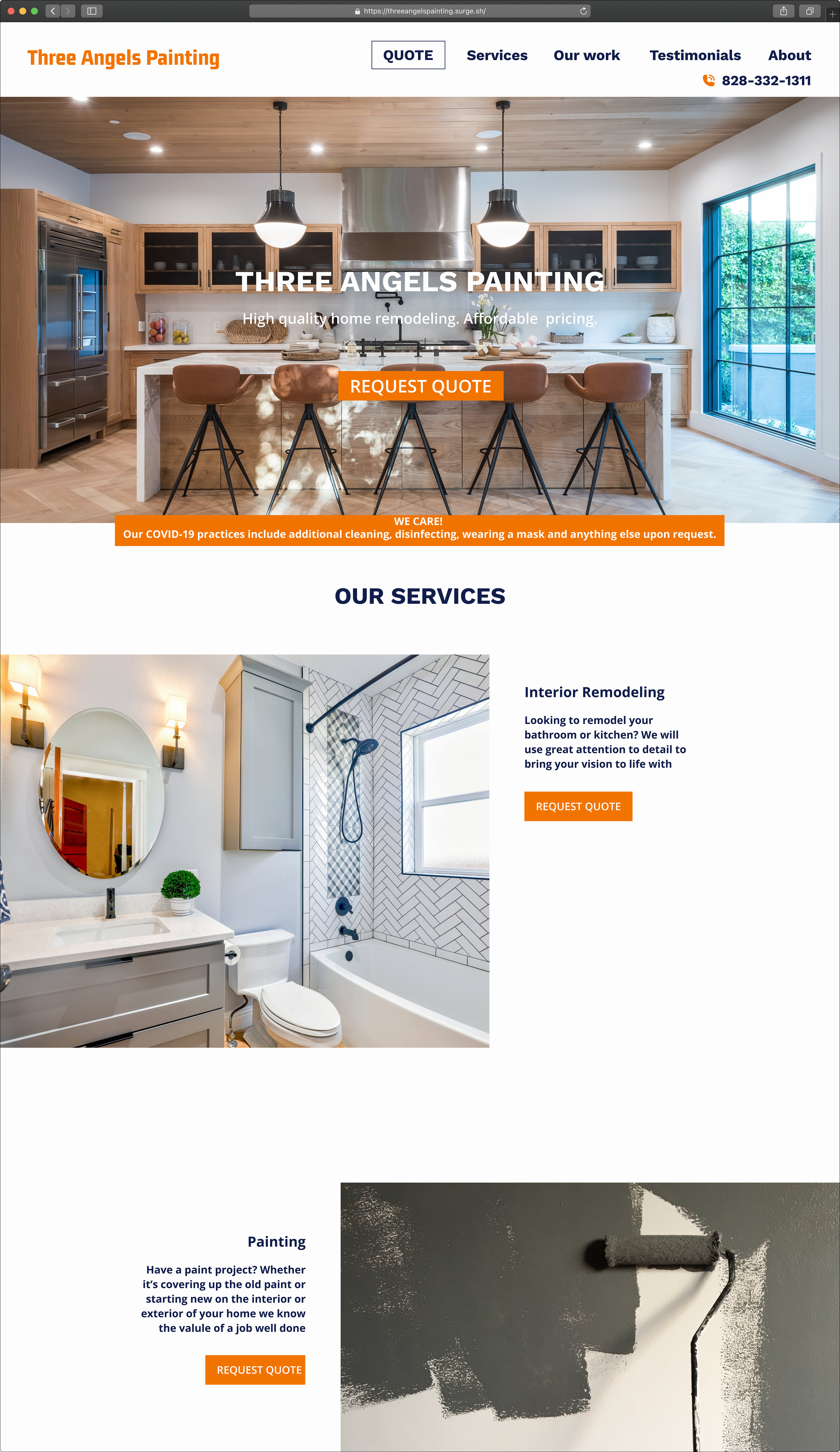
Knowing that conversion was the website and business goal I started off with a call to action as the first option in the navigation bar, at the main focal point at top of the page and throughout the page under each service option.
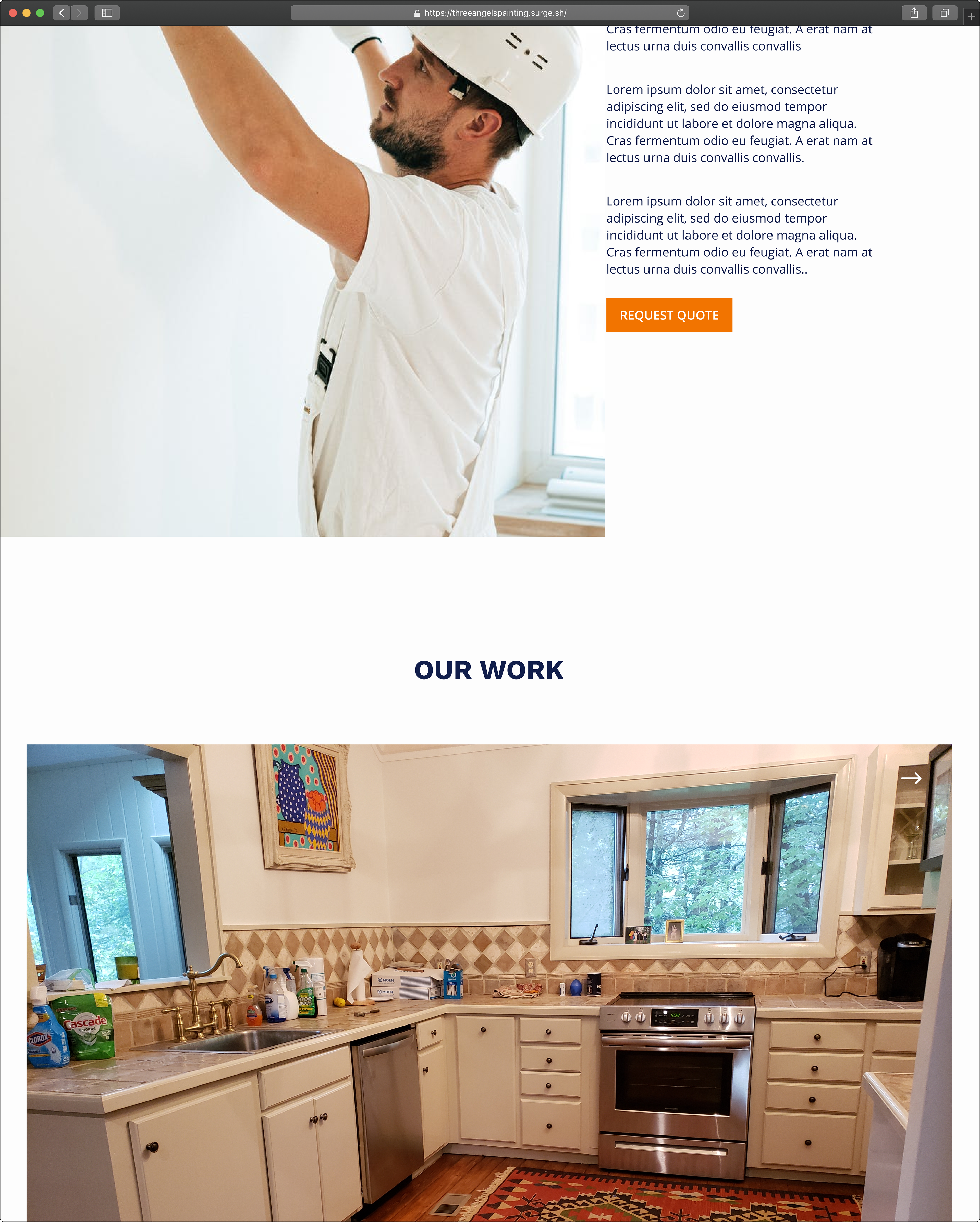
Based on findings from the C&C analysis highlighted in this case study I made sure to have a section for the client to showcase their best work.
I also added a section for testimonials.
Going Live
Final Thoughts
I truly enjoyed working on this website and learned a couple things.
I love collaborating! Even though I had fun having full reign over the design process as the only ux designer on this project, I realized how much I really enjoy working on a team and being able to bounce ideas off of others.
Working closely with a developer I got to see behind the scenes of how the site was coded which gave me better perspective of the engineer process
It was great to help a small business gain an online presence and the client was more than happy with the final design.

