Client
Stephanny Morales A. (Nurse Smile) — dental & medical aesthetics, Cali, Colombia
Timeline
2-week sprint
Team
1 designer, 1 developer
Tools
Claude (vibe-coded build)
The Brief
Stephanny's ask was simple: let patients book online, see who they'd be talking to, and find her clinic without a WhatsApp back-and-forth. But discovery surfaced bigger gaps fast — no hero moment to build trust before the scroll, no consistent call to action, zero testimonials despite aesthetic patients leaning hard on social proof, and no keyword structure to help her show up when someone searched "diseño de sonrisa" in Cali.
A booking-widget request became a full rebuild: hero, services, gallery, testimonials, booking engine, and contact, unified under one visual identity.
Research First
Before any screens were drawn, I scanned the competitive landscape — other dental and aesthetics sites in the region, most leaning on generic stock photography with no real booking flow and no differentiation. Then I looked further afield, to other corners of the medical field like veterinary sites, for layout and tone ideas outside the expected dental playbook.
Designing
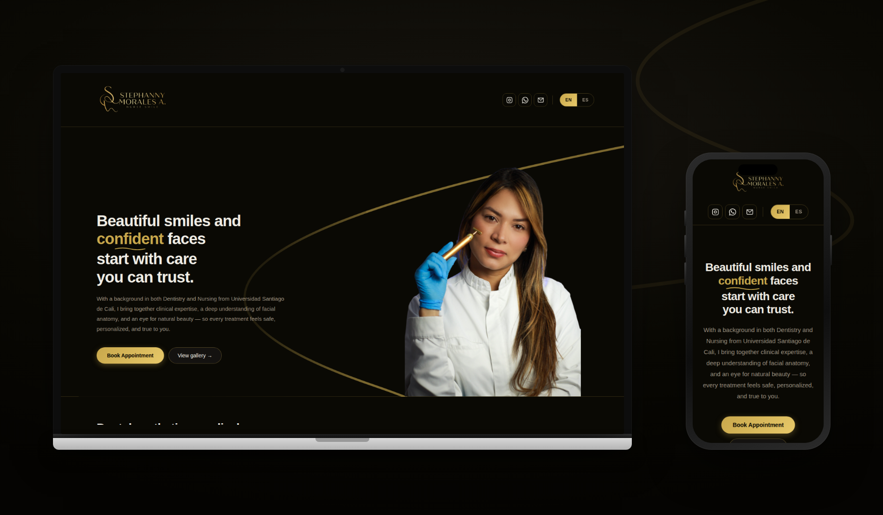
I started with the hero and navigation, anchoring contact and booking in constant view. Stephanny had a striking, high-quality photo — the hero was built to give it real spotlight rather than compete with it.##
Services split into two clear categories — dental and medical aesthetics — each collapsible and embedded in context, so visitors browse without losing their place.The visual language settled on deep black with a warm gold accent, gold-outlined iconography, and one recurring motif: a thin gold arch that sweeps behind the hero photo and reappears, faded, as a transition cue between sections — a small detail that gives the site continuity instead of feeling like stacked blocks.
Every category uses patient-friendly language over clinical shorthand — "Smile Design," "Teeth Whitening," "Resin Restorations" — so a first-time visitor can self-select without needing a dental vocabulary.
ai partner
This was a true two-person sprint, with both designer and developer working closely with Claude to bring the site to life. The design is currently being vibe coded. build to come soon.
built with accessibility in mind
with so much interaction living in custom components (the calendar, accordion service lists, the booking form), it had to be built in from the start:
Full keyboard navigation — every interactive element (calendar days, accordion toggles, form fields, language switch) is reachable and operable by keyboard, with visible focus states
Contrast-checked palette — black, gold, and white tested to clear contrast thresholds for both body text and accents
Semantic structure — proper ARIA attributes on the booking form so error states and expand/collapse behavior are announced correctly to screen readers
The layout was continuously checked end-to-end so content flowed seamlessly from desktop down to mobile, not just at one breakpoint.## What Shipped
In two weeks, "add three features" became a full rebuild:
-A hero section that establishes trust and credentials before anyone scrolls
-A clear, embedded services list (dental vs. medical aesthetics)
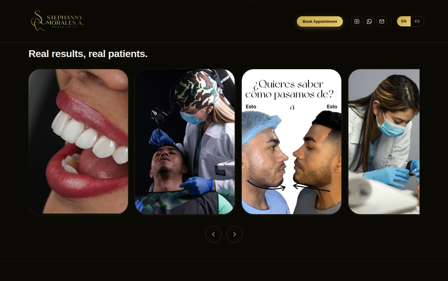
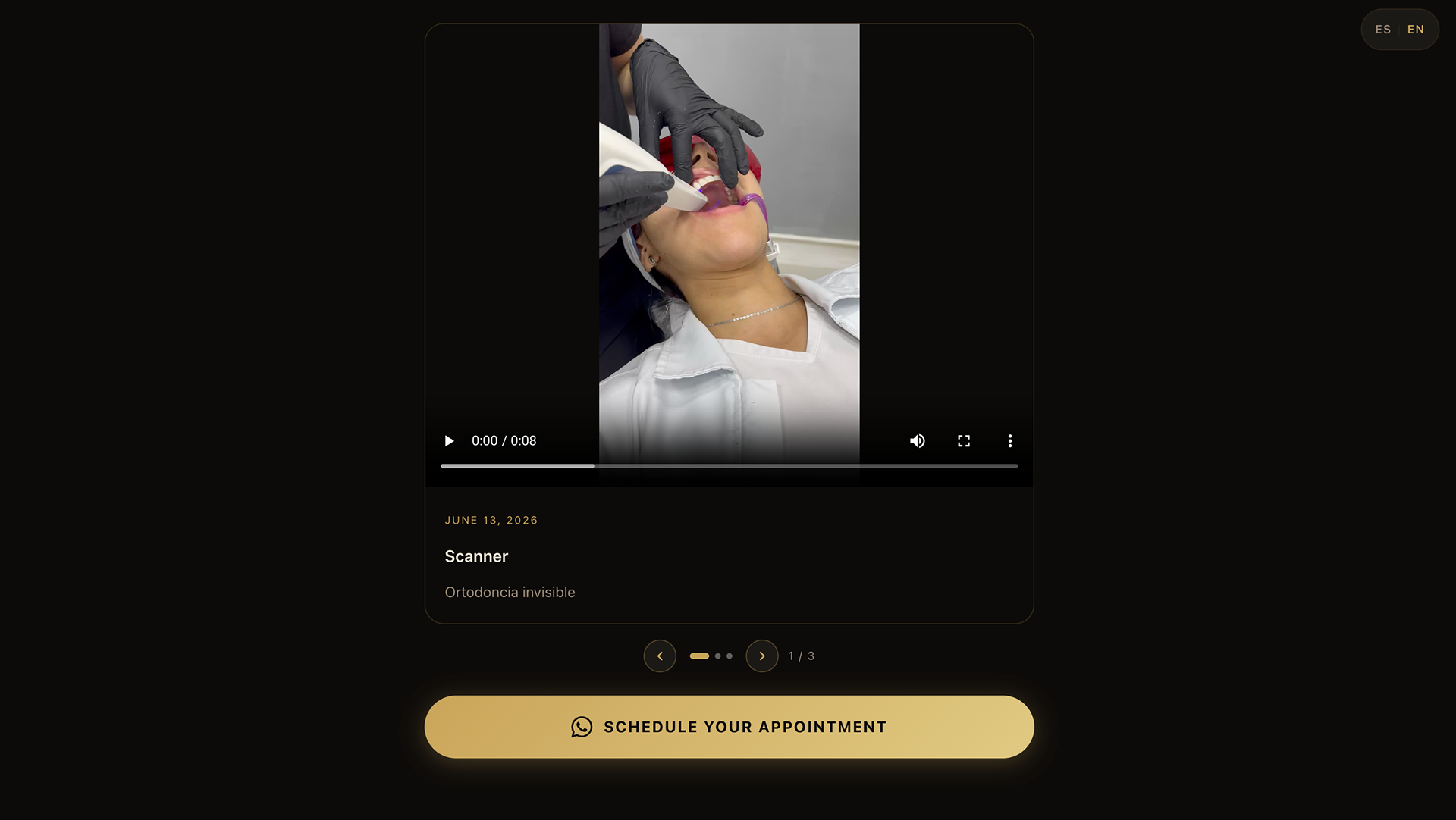
-A patient gallery and a "latest from the clinic" feed
-Testimonials for social proof
-A fully functional, bilingual booking engine with live calendar and validation
-A contact section covering the original ask — assistant, hours, location — plus Instagram, WhatsApp, and email
-Keyword-aware copy written for how patients actually search
-Keyboard accessibility and contrast compliance across every interactive element
The Outcome
The design is currently being vibe coded. build to come soon. design before and after images below in the meantime.
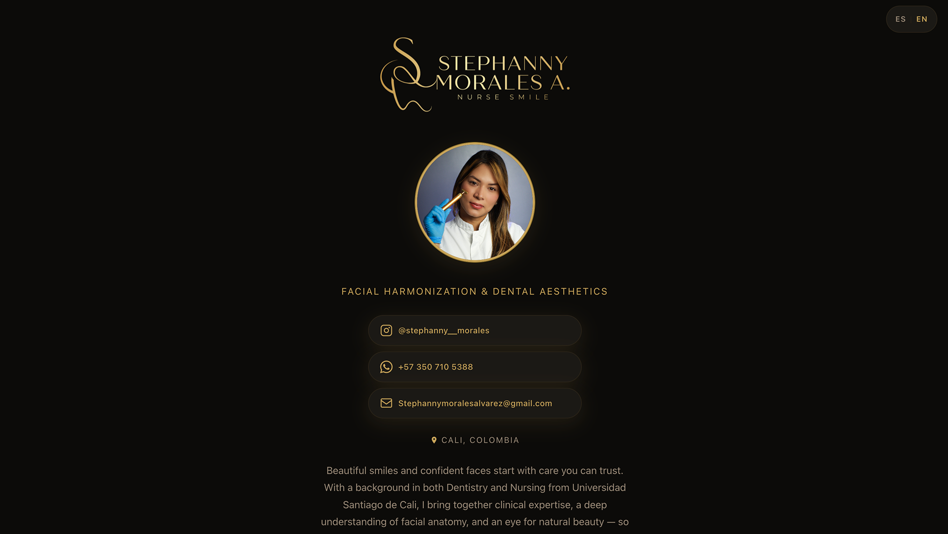
Top of site before
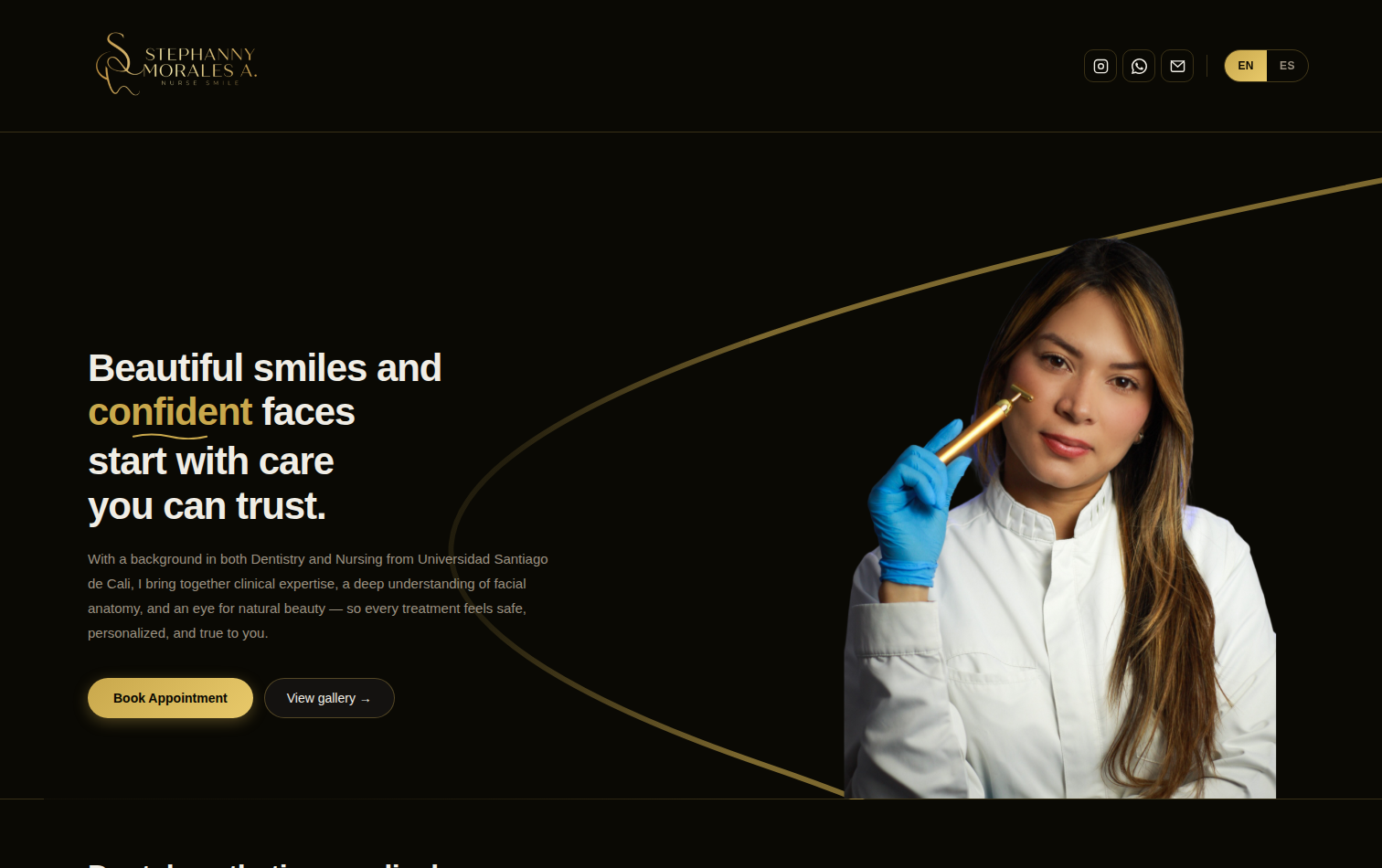
after Hero section
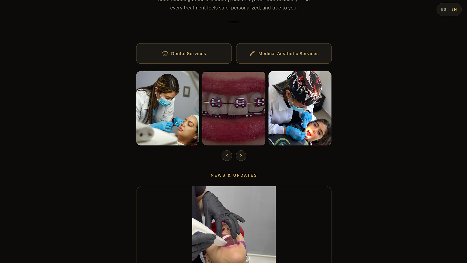
services and gallery before
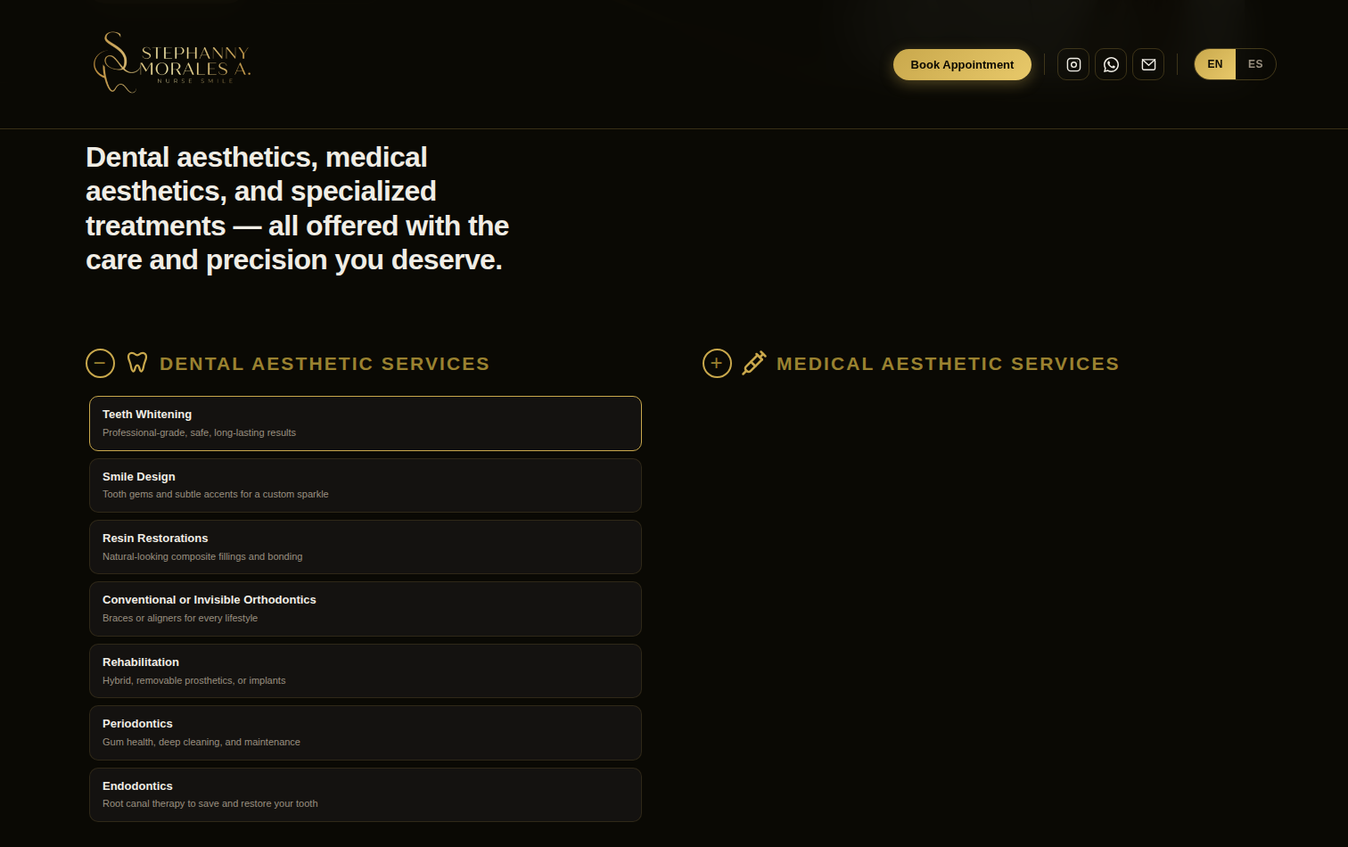
Services after redesign
Updates and booking section before
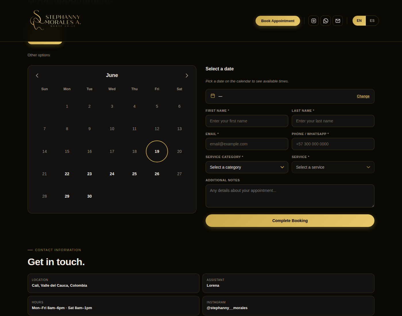
Booking section redesign